Carnegie Learning/Reports
Overview
The project aimed to enhance the efficiency and effectiveness of data reporting processes. Through strategic design and continuous improvements, it successfully streamlined reporting workflows, resulting in more accurate and actionable insights for informed decision-making.
Role & Proficiencies
Lead UX and UI Designer
- Data Visualizations
- Design Thinking
- Usability Testing
Tools
- Adobe XD
The Problem
-
The existing reporting system suffered from an outdated user interface, making it less intuitive and visually unappealing, which hindered user engagement and comprehension.
-
Over time, various ad-hoc updates led to a lack of consistency in the user interface, causing confusion and inefficiency among users.
-
Complex data needed to be presented in a user-friendly manner, but the existing system struggled to meet the demands of teachers and administrators, leading to frustration and reduced usability.
The Solution
-
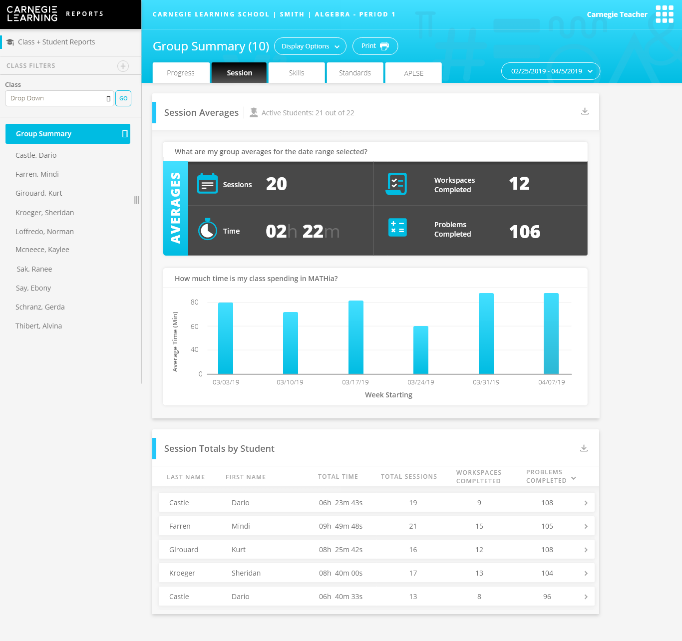
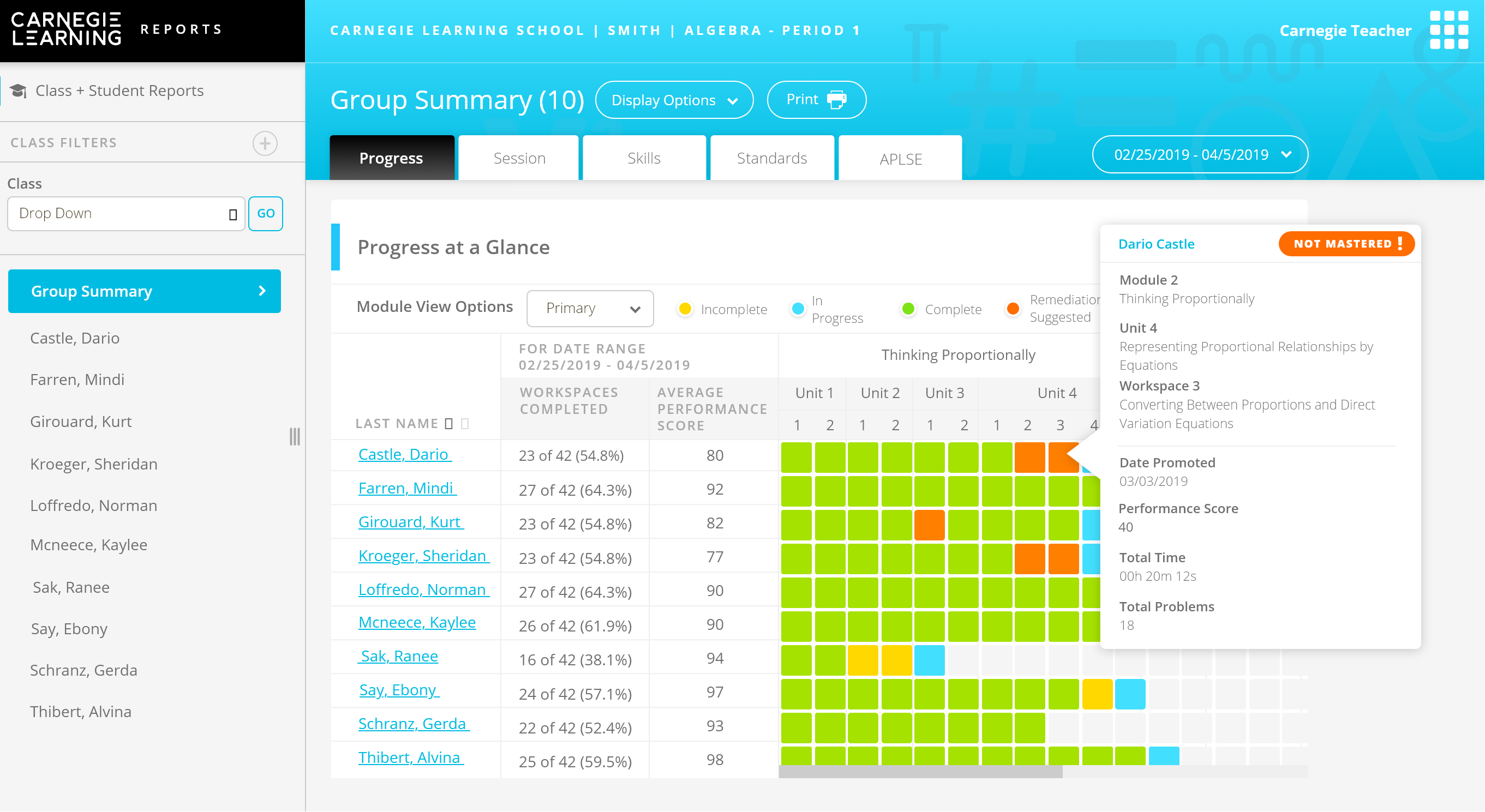
We implemented a comprehensive design thinking process to tackle complicated reporting needs. This involved user research, prototyping, and iterative design to ensure that complex data could be comprehended effortlessly.
-
The user interface was overhauled to simplify navigation and make it more modern and visually appealing. This not only improved user engagement but also reduced the learning curve for new users.
-
User experience was streamlined by optimizing workflows and creating a cohesive experience across the reporting platform. This included implementing clear data visualization techniques and user-friendly interactions.
The Outcome
-
With the revamped reporting system, teachers spent significantly less time hunting for information. This allowed them to focus more on their core responsibilities—teaching and interacting with students.
-
The new system facilitated better communication between school administration and parents. It provided clear, real-time data, fostering a more transparent and collaborative educational environment.
-
Teachers, with more efficient reporting tools, were able to dedicate more time to engaging with their students. This led to better student support and overall educational outcomes.
Wires, Prototyping & User Flows
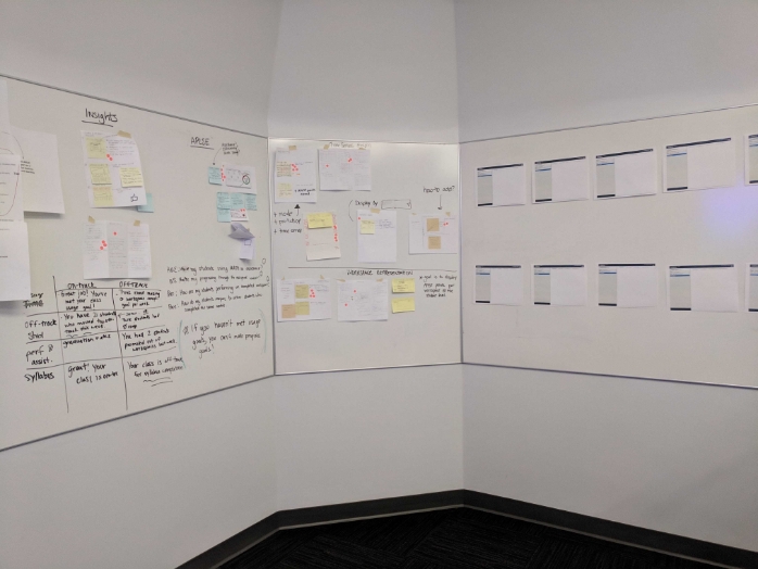
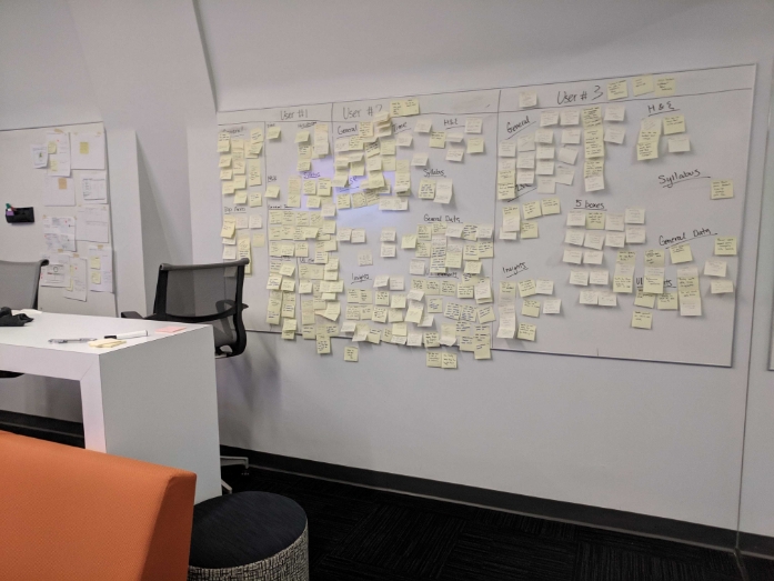
Designing thinking sessions were conducted to reimagine specific components of the system.
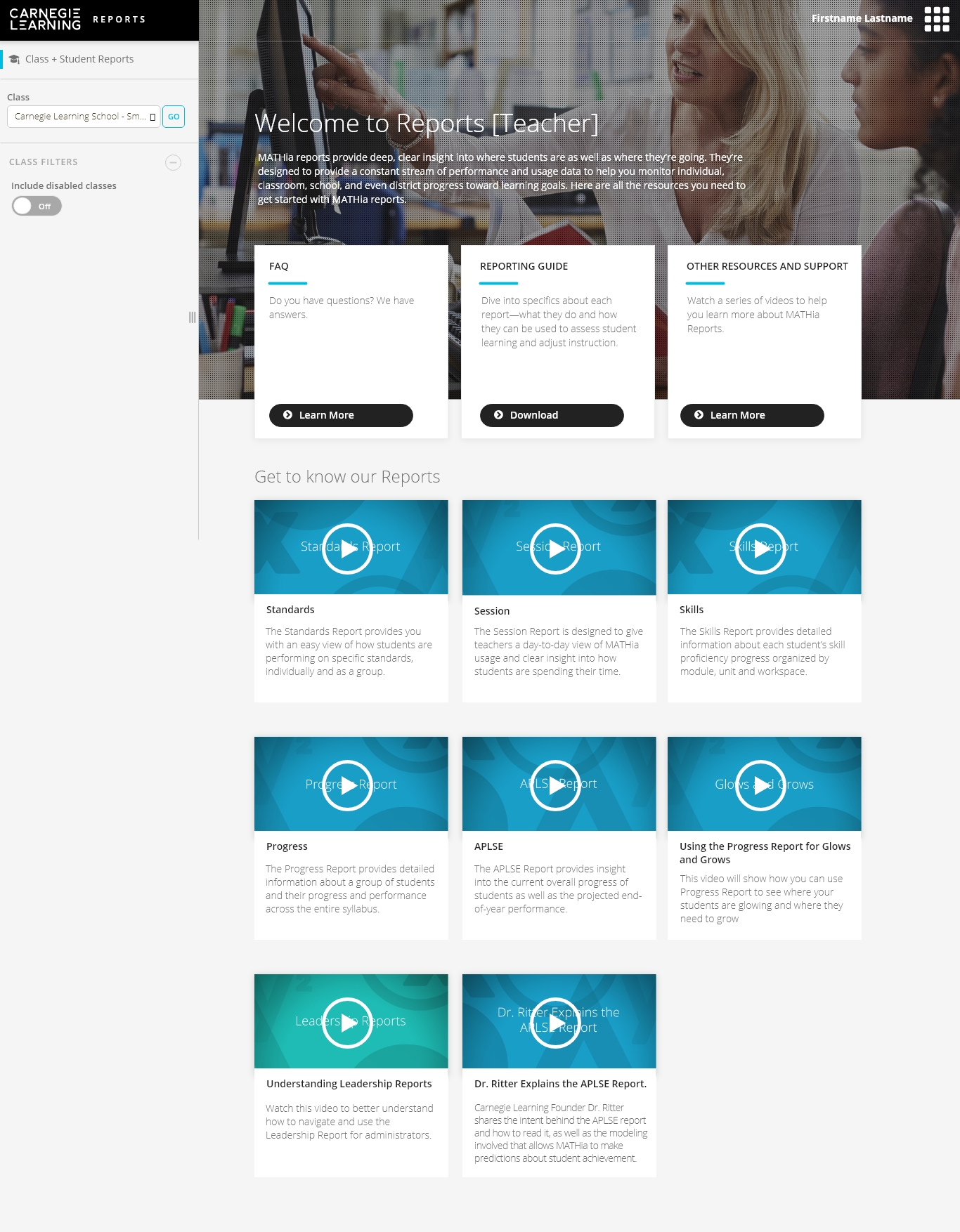
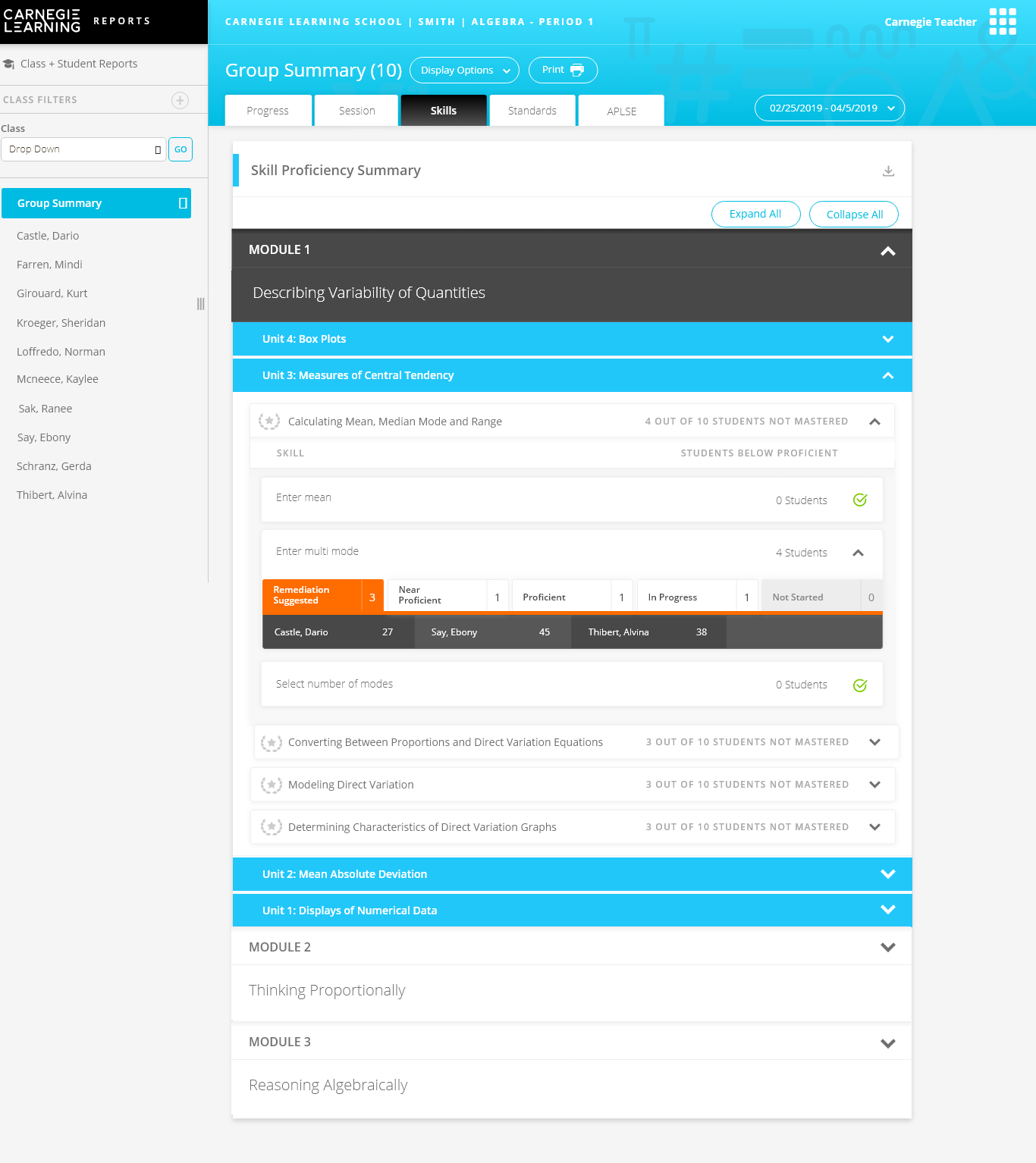
UI Examples

Connect with me.
(Or don't, I'm a footer not the cops.)
©2024 all rights reserved